Why AI fails at UX.
AI builds exactly what the prompt says, and everything mentioned along the way gets the same weight. The result is dense, hard to find your way through, and not built around the jobs people came to do. Here's why it happens and how to fix it.

- Published
- 9 September 2026
- Reading time
- 8 min
- Topic
- Product
Chapters
A lot of founders now build the first version of their product with AI, and plenty of them build it well. It runs, it looks current, and it does everything they asked for. Then the feedback starts coming in. Users say they can't find things. Someone reports that a journey is broken when nothing is technically broken. New customers need a call before they understand the screen. Everyone agrees it feels busy.
That's usually when we get the question: "We built the UI with Claude. Do we still need a designer?"
I want to answer it fairly, because the tools are remarkable and Jake and I use them every day. We prototype in code, we work inside AI-built prototypes instead of starting again in Figma, and we ship front-end code straight into our clients' repos. But there's one thing AI is consistently bad at, and it's the thing those reports are describing. It's not a mistake anyone made. It's how the tools work.
It builds what the prompt says
A model is built to do what it's asked. Ask for a chart of weekly sign-ups and you get one. Ask for a filter and you get a filter. Mention in passing that it would be nice to see last month's numbers too, and they appear on the screen as well. Ask it to make things clearer and it adds a line of explanation under every element, because that's the most literal way to make something clearer.
So the product ends up as a faithful record of everything that was said while it was being built. That sounds like a good thing. The trouble is what happens to all of it on the screen.
Everything gets equal weight
This is where AI-built product design falls on its face. Every request, whether it was the point of the product or a passing thought, gets the same weight and the same place in the hierarchy. The thing your customer opens the product to do sits at the same size, in the same kind of card, as a metric someone mentioned once.
The result is information-dense. Everything is there, and nothing has been chosen. It's then left to the user to unpick it all and find their own journey through it, which is exactly the work a product is supposed to do for them.
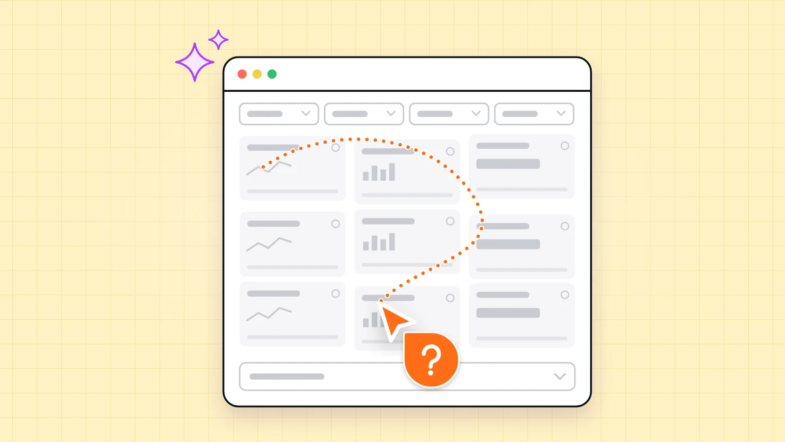
Here's a version we've seen, with the details changed. A data product built quickly and capably with an AI tool. Every data point that was asked for is on screen, each with a neat line of helper copy. The home screen is an overview that says, in effect, everything's fine. The thing customers actually come in to do, which is find what needs their attention and act on it, sits two clicks down, in a table that only appears when you open a dropdown. When you open it, the layout jumps.
Nothing is broken, and it does everything it was asked to do. It just wasn't built around the jobs people come to do. It was built around the conversation that produced it, and real use doesn't follow that conversation.
Five signs AI has designed the journey
If the feedback you're getting sounds like the reports above, look for these. None of them mean the product is bad. Each one is a place where a decision about priority hasn't been made yet.
Everything is shown and nothing is prioritised. Every metric that was asked for has a tile, and every tile is the same size. The eye has nowhere to land, so it lands nowhere.
There's helper copy on every element. A small line under each card explaining what it is. One or two are useful. When everything needs a caption, the structure isn't explaining itself.
The main job is buried. Write down the one thing users come in to do, then count the clicks it takes. If it isn't on the first screen, it should be.
Controls hide the content. Tables tucked inside dropdowns, filters to set before you see an answer, actions behind icon buttons. People have to ask the interface for the thing they came for.
The layout jumps when you interact. Panels resize, rows shift and buttons move when you click or expand something. It tells users nothing is quite settled, and they stop trusting where things are.
None of these are new, and none of them are unique to AI. When we audited InstaSwitch's app, one of the things we found was users missing actions that were hidden behind icon buttons. What AI changes is the speed and the polish. It produces these patterns faster than any team could, and a screen that looks finished doesn't invite anyone to question it.
It's built for everything the prompt mentioned, not for the job the user came to do.
Start from the job, not the data
So when we pick up a product like this, we start somewhere different from where the prompts started. Here's what a designer adds.
The user's job. We write down the handful of questions a user arrives with. What needs my attention? Is anything wrong? What should I do next? Then the first screen answers them, before anyone clicks. If something is fine, it can be quiet. If something needs action, it should be the loudest thing on the page, with the action right next to it.
Hierarchy. One thing on a screen is the most important, and it should look it. Then we decide what's visible, what's one click away and what can live somewhere else entirely. Usually the hardest part is the leaving out.
States. AI builds the happy path, with perfect demo data. Real products spend a lot of their time empty, loading, half set up, failing or showing someone their first day. Those states are where new users decide whether they trust you, and they almost never come out of a prompt.
Copy. Labels in your users' language, not your database's. On InstaSwitch, renaming "Income Sources" to "Income Tools", with one line underneath saying these are payment tools and platforms, not clients, did more than any visual change could. Good copy usually means less helper text, because the labels carry the meaning themselves.
Consistency. A product built across dozens of separate prompts tends to drift. The same thing gets three names, the same action works three slightly different ways, and two screens disagree about where the main button goes. Someone has to hold the whole product in their head and make it behave like one thing.
We don't throw the prototype away
A lot of founders expect a designer to look at an AI-built product, wince and suggest starting again in Figma. We don't, and you shouldn't let anyone talk you into it without a good reason. The prototype has real value. The data is wired up, the components exist, and it already shows what the product needs to do.
What we do instead is start by reviewing what's there: what users are trying to get done, how the information is structured, then layout, type and colour. That gives a plan with the biggest wins first. Then we work on the product itself. Where it suits your team, that means front-end changes straight into your repo. Where it's quicker to think in Figma, we use Figma. Either way your engineers keep building on the same code, now on a structure that holds up.
There's a second benefit people don't expect. Once the structure and the rules exist, the AI tools get better too. A model that's given a clear layout, a small set of components and a few rules about hierarchy produces far more consistent screens than one that's given a list of features. The design work makes the prompting better, not redundant.
What AI changes, and what it doesn't
My view, after a lot of time with these tools, is that code has become the easy part. A working front end is closer to a commodity than it has ever been. Working out what a product should do, in what order and for whom, is still the hard part, and it's the part that decides whether anyone keeps using it.
At pre-seed, an AI-built prototype is a brilliant way to learn. You can put something real in front of investors and early users and find out whether anyone cares, for a fraction of the effort it used to take. Polish the structure too early and you're polishing guesses.
By seed and Series A, it changes. Paying customers are logging in, new users are arriving without a demo, and nobody is there to click for them. That's when the reports about broken journeys and dense screens start, and when structure starts showing up in whether people come back. Jake makes this point well: how people react to a walkthrough is very different from what they do when you're not there.
When you don't need us
To be fair to the question: sometimes the AI-built version is the right one to ship.
If it's an internal tool used by the people who built it, they already know where everything is. If it's an admin panel, a quick test with a few friendly users, or a product with one obvious job that the AI version already puts first, a designer may not add enough to be worth it yet. And if you're still finding out whether anyone wants the thing at all, spend your effort there.
The step to watch is the one after that: shipping to paying customers, hearing that people are lost, and treating it as something more prompting will fix. Iterating on a structure that was never decided rarely settles down. You end up changing the UI on your users again and again, instead of getting the foundation right once and building on it.
Try it with a new user
Here's a test you can run without us. Find someone who has never seen the product, ideally someone like your customer. Give them one task, the one the product exists for. Don't help, don't explain, and don't touch the mouse. Watch where they hesitate, where they open the wrong thing and where they read the helper text.
Then go back through the five signs with what you saw. If the main job was easy to find, you're in better shape than the feedback suggested. If it wasn't, the fix probably isn't more prompting. It's a decision about what matters most, made by someone whose job is to make it.
The work behindthis post.
Starting with InstaSwitch, the project this post draws on, written up in full.
Keep reading.
All posts →Early stage, scaling or established?
Let's talk.
Most of our work is with fast-moving startups, but we work with teams of every size. Tell us what you're building and we'll tell you honestly how we'd help.