
Chapters
Decks2025
Sales deck.
A deck partners can follow
Context
Co-founders Jeff Forkan and Adam Dilek had a capable product and an engineering team, and a sales deck that did not yet match either.
Problem
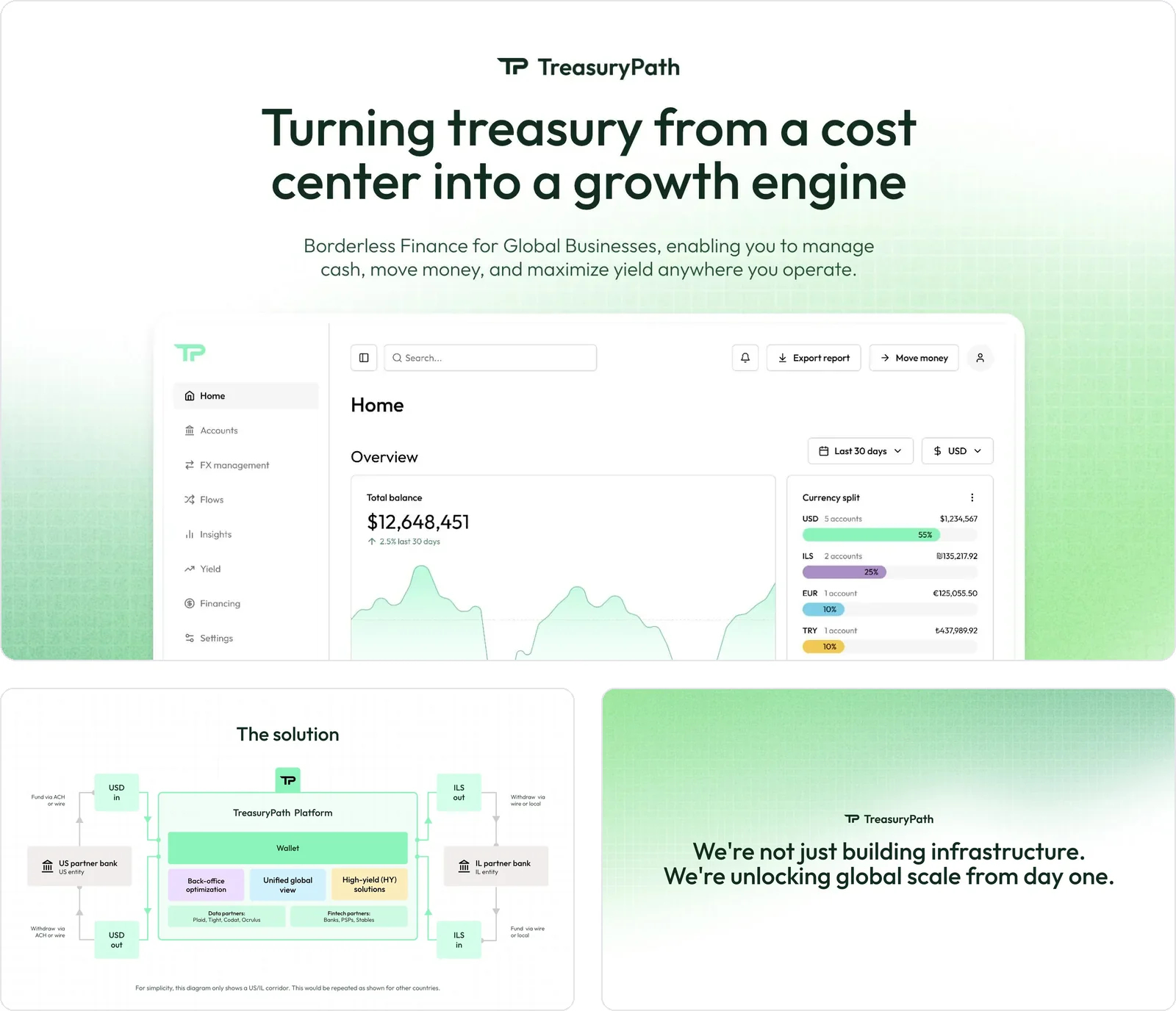
The deck’s audience, fractional CFOs and accounting partners, needed to understand the value quickly, without a product walkthrough. Some slides were strong. Others leaned on internal terms and dense layouts, and the solution section was hard to follow when presented.
Approach
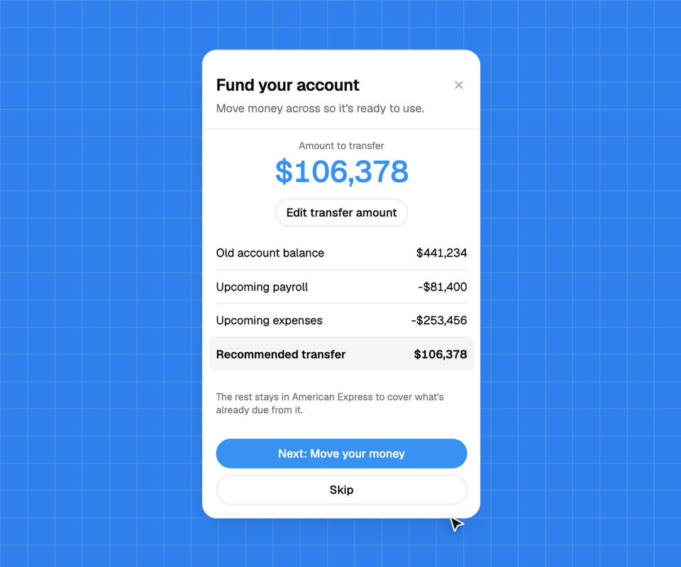
We kept the slides that worked and rebuilt the rest to match. We restructured the story so it builds when presented, simplified the solution section and questioned jargon in slide titles with Jeff. Generic imagery gave way to clean, product-like visuals drawn from TreasuryPath’s own demo environment.
Outcome
A deck that builds when it’s presented, with every slide now up to the standard of the strongest ones. TreasuryPath brought us straight back in for its website.
Websites2025
Website.
Designing through a repositioning
Context
Next, TreasuryPath needed a marketing site that looked like a serious financial platform, designed for its own engineers to build.
Problem
Partway through, TreasuryPath sharpened its position around FX, payments and global cash management, and dropped one audience. Designs built for the old story would have been wasted.
Approach
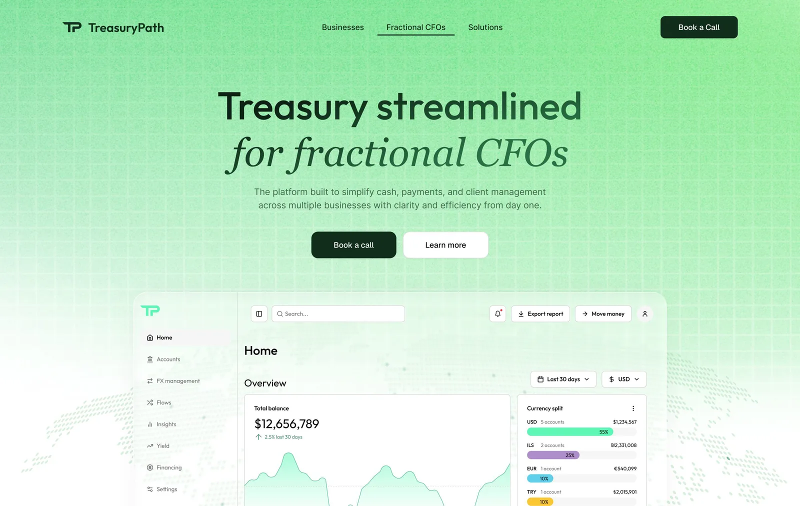
We had started in a clean, light direction aimed at fractional CFOs. When the position changed, we stopped polishing the old story and came back with three pages for the new one: Home, Treasury Services and Embedded Payments, in a dark style with the product dashboard over a dotted globe.

Outcome
Everything lived in one Figma file the engineers could pull colours, fonts and assets from, including transparent versions for the dark sections. Both co-founders signed off the final contrast pass, and TreasuryPath’s team built the pages ready to publish.