
Product design2025 to 2026
Product design.
Switching, funding and a white-label system
Context
InstaSwitch sits inside a bank or fintech’s onboarding. When a business opens a new account, it moves payroll, income platforms and vendors across, so the new account becomes the main one. Every partner puts its own brand on the flow.
Problem
Daniel West, the founder, asked us to audit the live app: where do people hesitate, is the main action on each screen obvious, what breaks trust? People were adding clients where they should have connected platforms, skipping the deposit step and missing actions hidden behind icon buttons.
And nothing could lean on InstaSwitch’s own look, because partners range from pale mint to fully dark.
Approach
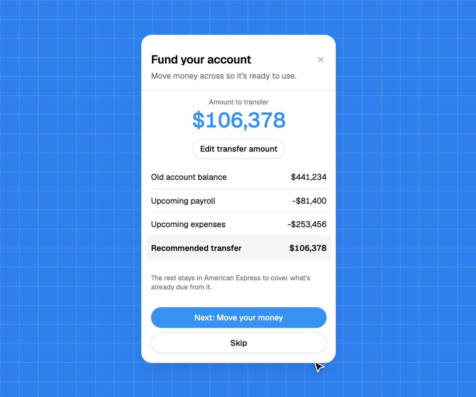
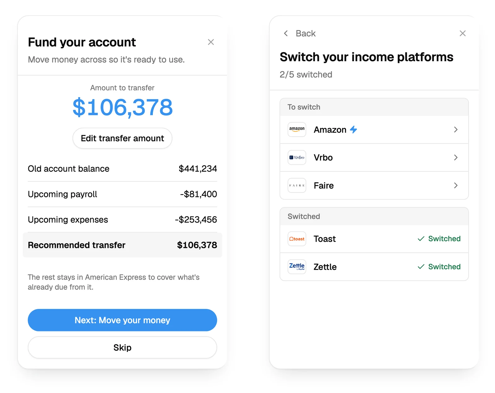
The audit became a plan: a guided onboarding kept apart from the main app, clearer cues and fewer words. Then we went screen by screen. “Move clients” became “Notify your clients”. “Income Sources” became “Income Tools”. The funding screen leads with one recommended amount and confirms before any money moves, and switching lost its separate confirm step.
Outcome
We wrote a spec that reduces a partner’s brand to five tokens, keeps one coloured button per screen and locks red and green so an error always looks like an error. A coded reference build runs several brand themes on the same components.
Engineering now builds from one source of truth: the Figma file, the flow spec and a diff map, all on the same section numbers. The sales team has a working prototype for every prospect, in that prospect’s own colours.
Websites2025 to 2026
Website.
A Framer rebuild and the launch site
Context
InstaSwitch’s site was on Webflow, so every change waited on a designer. It also needed a page for each partner it launched with.
Problem
For the public launch the site had to speak to two buyers, fintechs and banks, and give the team somewhere to publish articles, video and downloads without us.
Approach
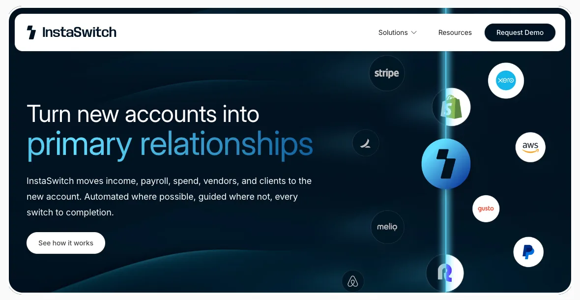
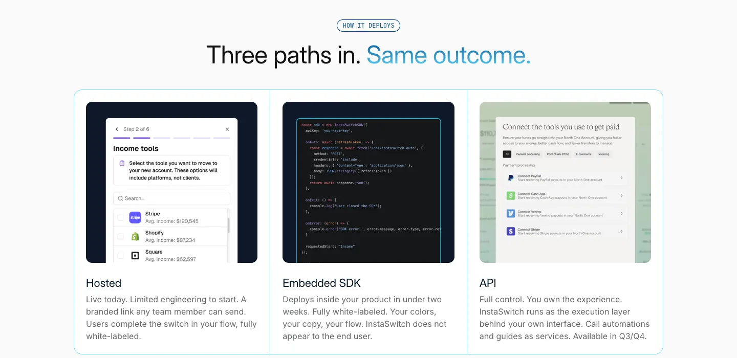
We moved the site to Framer so the team could edit it, with a partner page template that has been reused partner after partner. For the launch we designed and built the new site: a new homepage, pages for fintechs and for banks, a resources hub on the CMS, careers and a demo page.
Outcome
The new site went live the day InstaSwitch launched publicly. The team runs it and the resources hub themselves, and new partner pages go up on the same template.
Decks2025 to 2026
Decks.
Demo day, investor and sales decks
Context
The first thing Daniel asked us for was a demo day deck, for a presentation the following week. It has grown into every deck and one-pager the company sends.
Problem
InstaSwitch was explaining a category most people had never seen. Investors and bank buyers needed to get why switching is broken, and why it matters to a bank, in one pass. The early decks carried too much text for a founder presenting live.
Approach
We cut the words on screen so it would not read as scripted, reduced the slides, framed the problem positively and built animated visuals for the switching steps. The same system carried into the customer and investor decks, the seed deck, one-pagers for fintechs and banks, and a master template in Google Slides the team duplicates for each conversation.
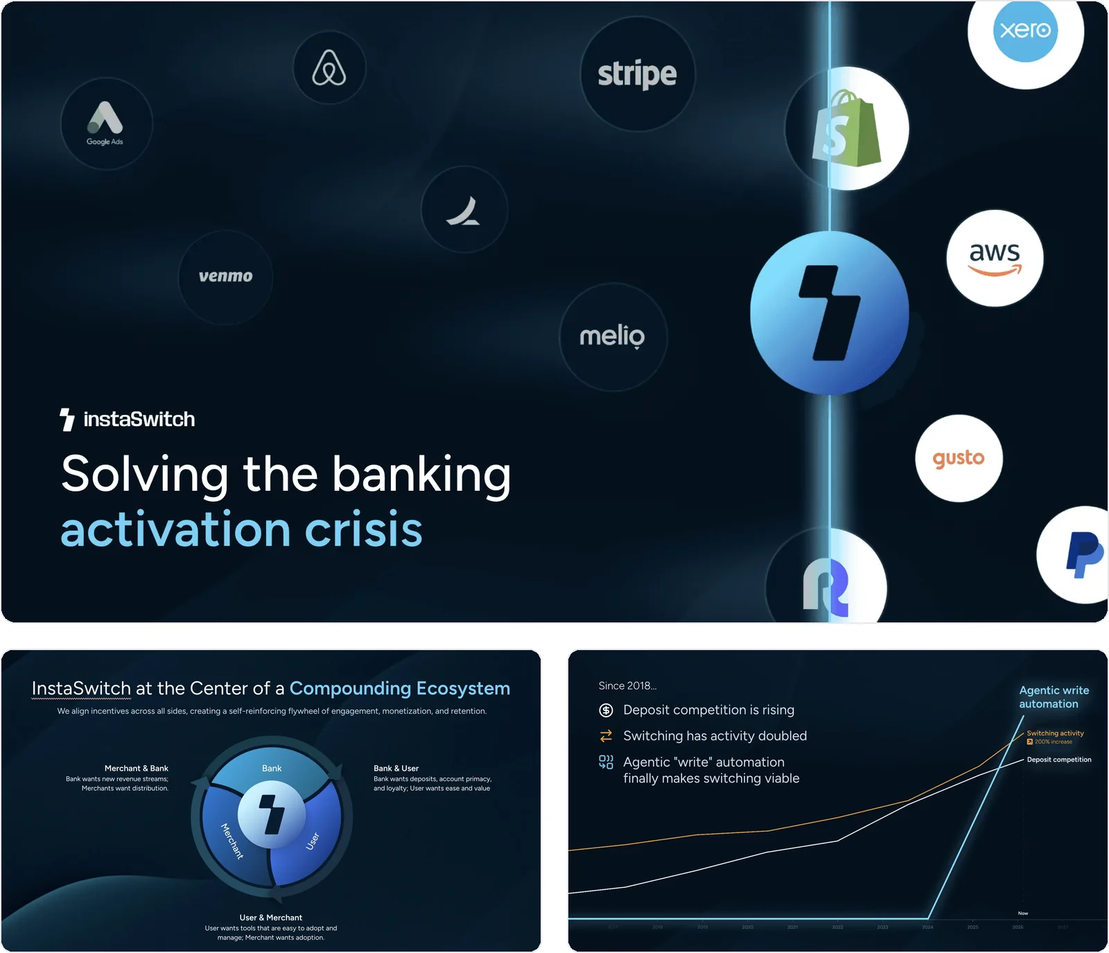
Outcome
Demo day went well, and Daniel came back to tell us the slides had landed with the room. Today the team duplicates the master template for each new conversation instead of starting from a blank file.
Brand2026
Brand.
Logo refresh and lockups
Context
InstaSwitch’s mark sits next to banks’ and fintechs’ logos on co-branded pages, in decks and inside the product itself.
Problem
It needed a logo set that holds up at every size and beside other brands, from a favicon to a co-branded header.
Approach
We refreshed the logo with a capital I, then made the full logo, the bolt logomark and social lockups, with versions for dark and light backgrounds.

Outcome
One consistent set of logo files for the site, the decks, the product and every co-branded page.